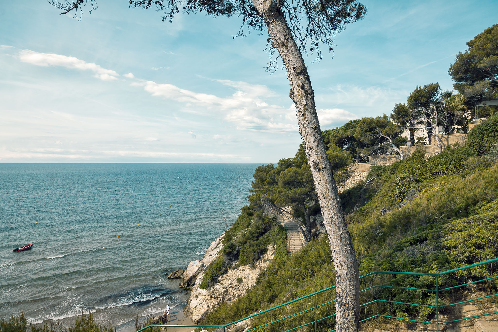
In the other photo rework posts to date I’ve concentrated on pulling out details from the pictures that had previously not been there but for this shot I’m doing something a little different and going for more of a tone and feel alteration to the image.
The original photo was taken on a walk we undertook along the Salou coastline although you won’t find this photo on that post (at time of writing this) as I initially created it when I was more discerning regarding the number of photos uploaded on any post. From our hotel there was a very pleasant clifftop and beachfront walk to the main part of town if you didn’t want to wait for the bus and we rarely want to wait for the bus if there’s a chance to get out and point the camera at anything of interest. There’s not a lot to say about this photo that isn’t immediately evident: there’s a small bay surrounded by low, rocky cliffs and steps leading down into it as well as a path around the top. We would take the path on this occasion although we did venture down into the bay on a couple of days during our stay in Salou as it provided a more pleasant environment for a swim than the more accessible but more packed beaches elsewhere along this stretch of the coast.
Processing for this photo mostly centred on colour but the initial step was to create a sharpened duplicate of the original to get a little more definition in the clouds, then boost the whites and overlay this at about a quarter opacity luminosity. This gave a slight boost to the brighter parts of the image as I wanted something a little bolder than the original shot without adding too much contrast. I added a channel mixer adjustment layer and in both the green and blue channels I boosted those colours respectively by about 5% while dropping the red by the same amount; on the red channel I dropped the red another 5% and gave that back to the blue. The overall effect was a cooler, slightly more saturated image thanks to the abundance of blues and greens in the initial shot. The main colour tone change then came as I applied a colour lookup adjustment at 60% opacity in colour mode; the lookup I used was a prebuilt one by Adobe called TealOrangePlusContrast. I added a tweak to the curves, keeping the blacks where they were but adding some more white into the top 10% of the range to finish things off and produce what to me is a very calming scene.
