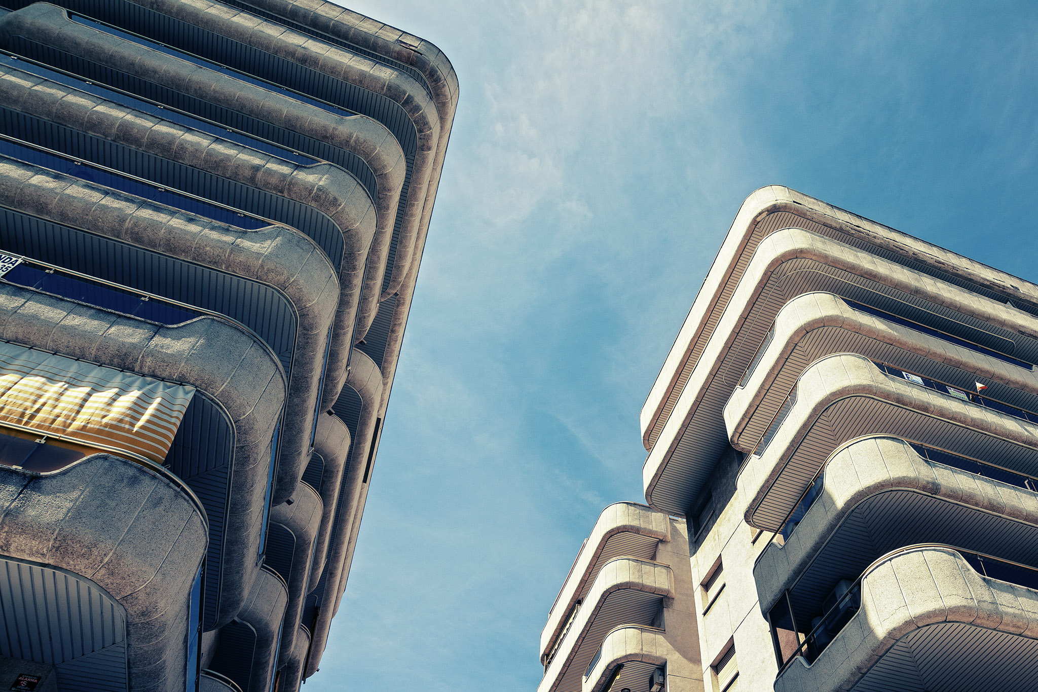
These matching buildings were set along the main promenade of shops and apartments set back from the seafront at Salou, taken when we visited this lovely part of Spain in 2012. I love modernist architecture like this; brutalism speaks to a retro-futurist feeling of optimism cloaked in gritty reality. It’s an efficient solution that brings hope wrapped around crushing despair, and it’s bloody gorgeous to look at.
What I really like about these buildings are those curved edges. You can tell there’s some Streamline Moderne influences there, but what’s especially appealing is the way it almost looks padded, soft, like you could run headfirst into it and bounce off without a scratch. Do not try this.

Processing was pretty basic. The original image was cropped to remove some foreground distraction, then overlaid with an urban acid treatment to bring out teals and pinks in the colour scheme and to boost the contrast of the shadows in order to dirty-up the pollution on the building’s concrete exterior.