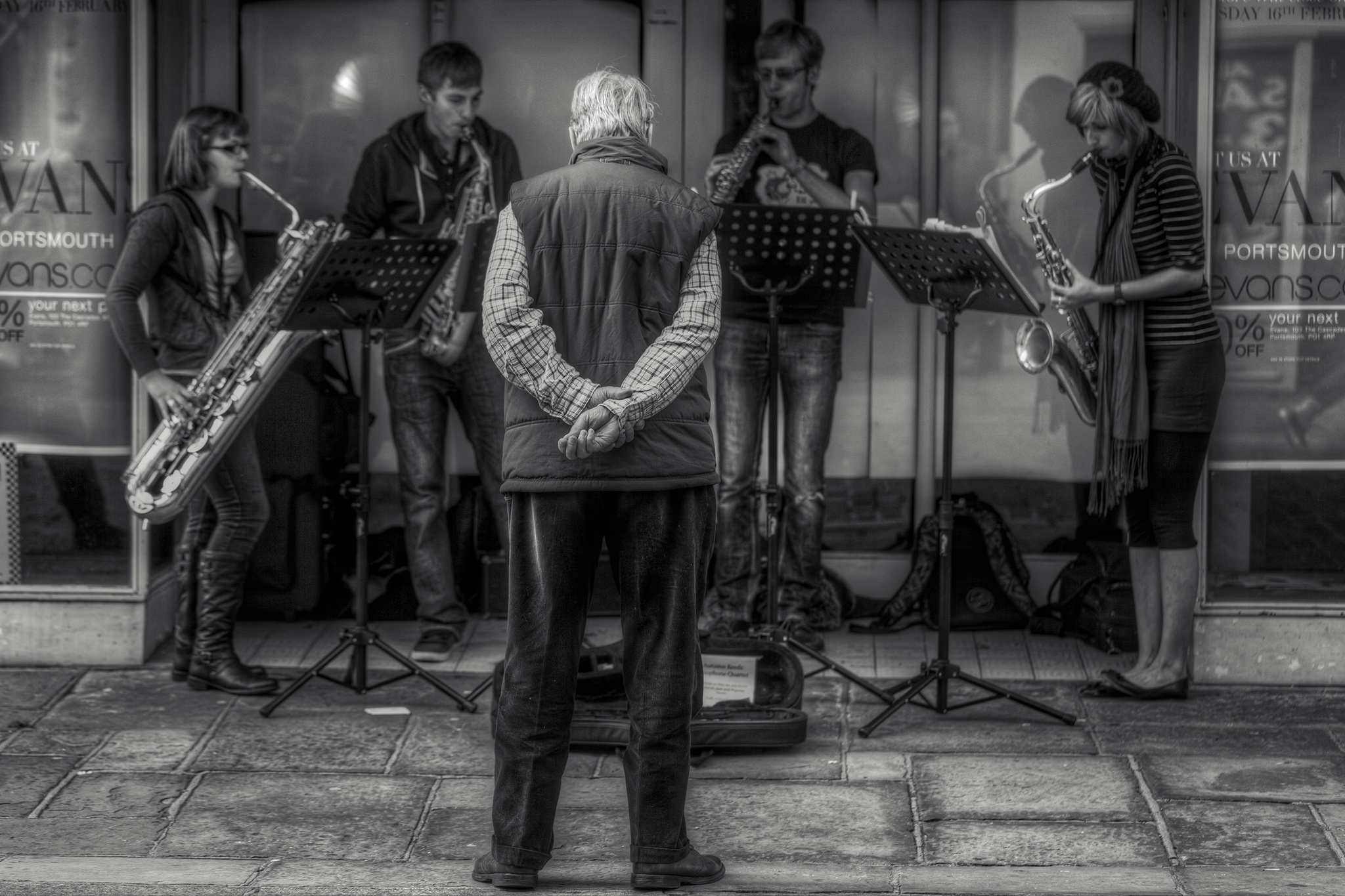
Rolling the clock back a few years, I used to very much enjoy street photography. I wasn’t very good at it because some of the everyday snaps of life that would probably have made the best photos crossed over that threshold in my mind that said “Maybe give this person some privacy in this situation” instead. Street photography can be a controversial subject in that respect but it’s weird how some people who might object to it see it as markedly different from people-watching which they could argue they enjoy. How different is it? A discussion for another time.
A second reason I wasn’t good at street photography was because my equipment wasn’t ideally suited for the task. You can’t be discrete with a DSLR and shutter you can hear fire from tens of metres away so I tended to go with a 100mm lens to get distance and zoom; that’s very much not your typical steet photography setup. And a third reason I wasn’t good at street photography was because an awful lot of my attempts to do so took place at lunchtime in Chichester where I worked at the time. Not the largest or most fascinating of places, not the widest range of people with stories to capture.
Okay, that’s the subject matter excuses out of the way. Here’s the latest photo rework and it features a shot from one of my lunchtime street photography sessions back in 2012 with the main reason I’m sharing it being to explain the processing that I used a lot on my photos at the time. This one hadn’t had that processing but I’ve revisited it and applied it now so that I can explain what I used to do to make the images pop out a bit more and add in some atmosphere. The picture, as you can see, is of a group of four buskers playing jazz in a shopfront while a single man forms their entire audience.
First thing I did, obviously, was crop and frame the image to get the buskers as equally spaced from the edges as possible. I wasn’t quite directly behind the audience so couldn’t frame him dead centre but I don’t think that’s a bad thing here. Next, also obviously, was some basic processing to desaturate the image completely and apply pretty standard adjustments to the whites, blacks, highlights, and shadows so that no shadows were lost or highlights blown out. That gave me a base image which was saved. I then underexposed the image by one full stop in Photoshop, increased the contrast, and saved that image, then did the same thing with a version that was overexposed one full stop. This gave me three images which would form the basis of a pseudo-HDR image at +/- one stop.
Photoshop does have the ability to play with HDR images but it’s nowhere near as good as a piece of software called Photomatix Pro from HDRSoft which I’ve had for years (version 4.1.1, in case you’re wondering). Using that, I loaded the three bracketed images and set the Exposure Value to 1 as that’s how many stops difference I’d generated to allow it to merge the image layers. This was tonemapped with an emphasis on contrast and using some lighting effects to bring out details in the background a little more. Playing with the sliders, adjusting the gamma and luminosity, all a matter of personal preference. The resulting image was saved and reopened in Photoshop.
The image was duplicated so that it could be treated to an Urban Acid wash. I have a plugin that does most of the work here (you can find one for free by searching online) but the gist of it involves applying a new colour swatch and filling in an adjustment layer over the top with a reduced tolerance range and curves to form a grittier, more contrasted image emphasised towards the blue and green colours in the spectrum. I like to increase the amount of red in the curve layer at this point to bring in more yellows and browns overall. This image is then layered over the top of the original in Hard Light mode and the opacity reduced substantially to around 20% depending on taste.
It sounds a lot of work but it’s actually a very quick process once you’re used to it and it can take as little as 3 minutes to get from the initial photo to a finished piece. The final photo then has more range in the shadows which often picks out more information in wrinkles or hair on people, generally feels more “street” if such a thing can be said without more explanation, and just has a lot more mood to it in my opinion.
