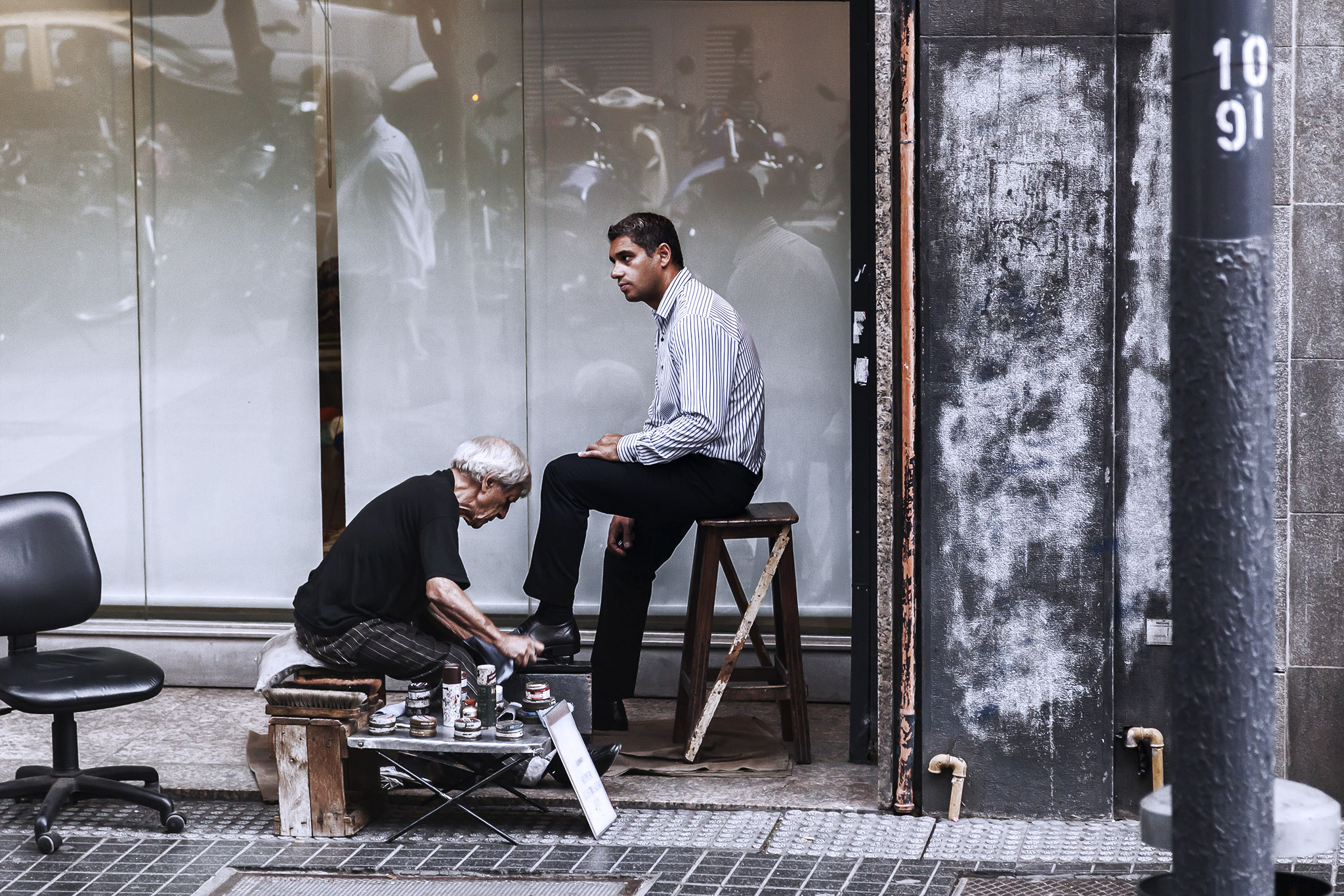
The time to take another look at an older photograph to process it in another way is upon us and today I’ve selected a shot taken from a bus during our full day on an excursion in the city of Buenos Aires, Argentina, the embarkation port for our 2016 cruise aboard Star Princess; you’ll be able to see the original photo on that first link.
Taking photos on public transport isn’t something I like doing. While I’m not a perfectionist when it comes to photographs by any stretch there are still some things I hate seeing in pictures: sensor dirt, blurring, and reflections on glass are three of those things and when you’re on a bus, for instance, there’s a good chance you’re going to get the last two and depending on how clean the windows are where you’re sitting you might get something that looks a lot like the first one as well. In addition, windows on public transport are often tinted or polarised which can be a blessing or a curse. In bright conditions they might help prevent overexposure and loss of data in the image but with an increased risk of reflections; in darker conditions the tinting can effectively strip out some of the colour information. All that being said, I love street views, I love the real life activities, I love seeing people going about their business or signs of the local culture as we pass by (typically on an excursion), and I love the elevated angle that just changes things slightly from the view at street level.
And so to the shot itself, that being of a man having his shoes shined in the Argentinian capital city.
The first thing I changed was the crop slightly, taking out the back of a man walking past on the left because his foot was blurred with movement, an artefact of the slower-than-ideal shutter speed thanks to the window tinting reducing ambient brightness. I next reduced the aqua and green tones in the picture to compensate a little for the tint and increased the exposure and clarity a little as well as pushed the white in the image to maximum. I duplicated the image layer, increased its contrast, sharpness, and texture to get something a lot grittier, then overlaid that at around two thirds opacity in a lighter colour blending mode. This took out some of the warmer tones in the picture, gave a boost to the chalky elements on the street surface, and added highlights to the skin of both men, accentuating bones and muscles. I wanted to make the picture cooler and grittier still without making the image too sharp as that would just introduce far too much noise in the darker areas so I took another duplicate layer and this time applied a high key treatment to it to oversaturate the brighter colours towards white. I overlaid this at half opacity with a hard light blending mode which made the blacks really black and the lighter areas both more bold and less dappled with colour. This did lose some of the definition in the black trousers and tee-shirt but for what I was going for here, this was okay. Finally, the image was still a little too warm to me so a simple deep blue photo filter applied at the end cooled everything down nicely, removing the remaining greens and sepia tones in the shop window especially.
