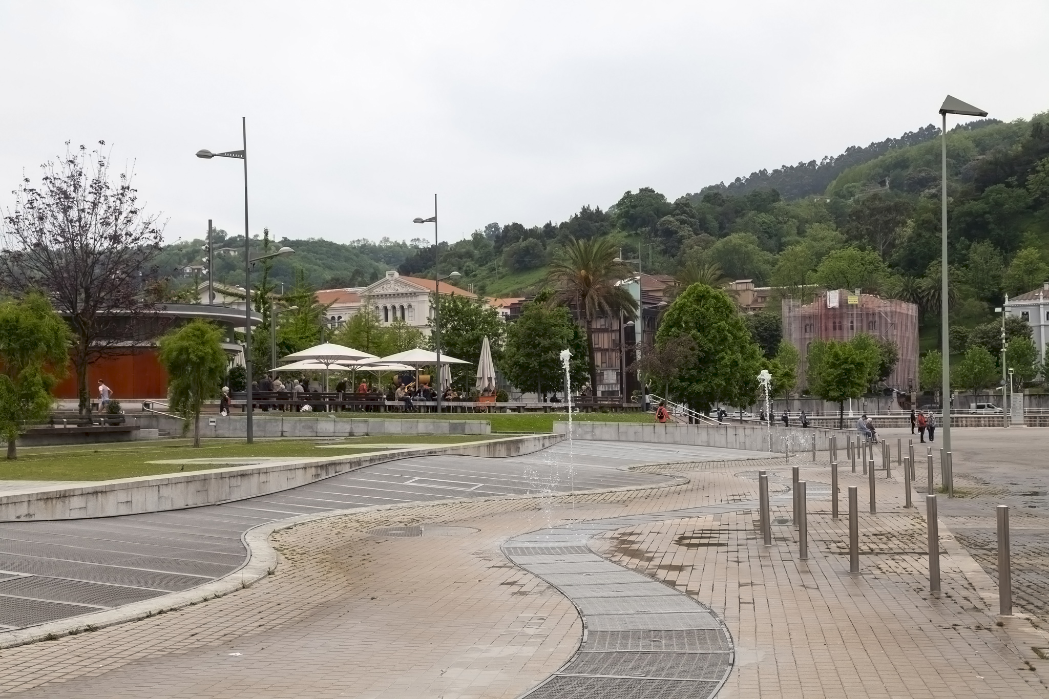
At the conclusion of our walking tour of Bilbao we jumped back on the coach just beside El Arenal park and enjoyed the short drive (around a kilometre) to the area of the city called Abandoibarra. Historically, this area was an industrial zone, home of shipyards and freight-handling buildings when vessels came much further down the Nervión river than they do these days. In the 1990s a programme of regeneration to transform the area into one for leisure and tourism started up. Some before and after photographs of this area of Bilbao can be seen here: Abandoibarra Masterplan.
From a distance the most obvious sight of new development is the Iberdrolar Tower (architect: César Pelli) but the place we’d come to see – indeed, probably, most tourists come to see – was the Frank Gehry-designed Guggenheim Museum. It really was designed that way and isn’t the result of a too-proud architect refusing to acknowledge he shouldn’t have built his prototype model from chocolate and left it on the parcel shelf in the back of his car on a sunny day.
Our tour group was met by a second guide and split into two outside the entrance to make it easier to take us through the museum. The actual process of getting into the museum was very easy and although we’d been warned about not taking in large bags the checking of these did not look too stringent to me; indeed, the space in the museum is so vast it’s arguable that any large bags would really get in the way at all but you should be prepared to surrender them just to be on the safe side, especially if the museum is very busy or if you want to chance your arm and wheel a suitcase in. Single adult tickets bought online at time of writing this are €16. We gathered in the inner atrium (after another long wait for people to use the toilet, naturally), a space Gehry nicknamed “The Flower” due to its shape and the only interior location of the museum that permits photography.
The angles and sweeping curves of the interior reflected a lot of the design of the exterior of the Guggenheim Museum though with understandably different materials in play. The prominence of white and huge windows in the atrium that looked down to the river and allowed in light also brought in some of that external material – the titanium sheets – allowing us to touch them. The titanium was chosen so that it would change appearance as it aged – “Yo, Gehry, what’s with the weird colouring?” “Er, yeah, no, er, I meant that” – and the overall shape of the building was generally just random although many critics see waves and ships or fishes or melted chocolate in the back of cars in the design.
A criticism of this point in the cruise excursion, though, is that we spent an awful lot of time in the atrium hearing the history of the area and the building, the materials, the design choices, the critics’ views, etc. While a lovely place and a very informative talk from a very knowledgeable guide the things we’d really come to see were the exhibits. Revisiting my argument from the walking tour of Bilbao portion of this organised trip, had the two elements been reversed in the order in which they were undertaken we could have heard this history on the coach on the approach to the Guggenheim Museum giving us extra time to see what it was housing.
Stepping through a doorway off the atrium opposite the entrance we emerged out onto a concrete balcony in the outside air where we could get up close to Tulips by Jeff Koons. From the official website description:
Tulips, a bouquet of multicolor balloon flowers blown up to gargantuan proportions (more than 2 meters tall and 5 meters across), belongs to the ambitious Celebration series, initiated by Koons in 1994. […] With its immaculate, reflective stainless-steel surfaces, Tulips recalls earlier works by the artist such as Rabbit (1986), which similarly transformed a banal inflatable object into something hard, gleaming, and iconic. In Tulips and in the balloon animals that populate the Celebration series, as in his towering Puppy (1992), Koons has manipulated scale, as well as materials, to uncanny ends. While Tulips might evoke the large industrial forms of certain Minimalist sculptures, the buoyant, colorful sculpture equally brings to mind a jaunty parade float.
One of Koons’s other creations, Puppy, referenced in the quote above was present near the entrance to the Guggenheim but was covered in scaffolding for repairs and subsequently not photographed.
Back inside we next went into the largest space on the ground floor, the Arcelor Gallery (formerly the Fish Gallery), housing the permanent exhibition piece The Matter of Time by the sculptor Richard Serra. This was a strangely compelling, fun, if arguably disturbing place and I wish we’d had more time (ironically) here. The cavernous space is host to several, weathered steel constructions arranged in spirals or waving lines or numerous other configurations that you can wander through. Our guide took us through one which simply spiralled in on itself but the distance between the walls of the spiralled steel varied and the inward- or outward-leaning angles of the walls of the free-standing structure varied too as you moved into the sculpture’s interior; the effect was disconcerting with feelings that perhaps you were walking at an angle or that the space was confining or expanding and, overall, a loss of sense of just how far or even how long you’d walked before reaching the central space. It’s not just a must-see exhibit, it’s a must-experience one.
The following photo comes from The Matter of Time works page on the Guggenheim’s website just to show you the sculptures from above.
After an all-too-brief visit to the permanent exhibition we were taken through the other rooms of the Guggenheim Museum to see what they were showcasing. One Hundred and Fifty Multicolored Marilyns by Andy Warhol was a very obvious eye-catching piece but there were some works by Jean-Michel Basquiat I quite liked too. Museum employees were kept busy stepping up to remind people not to take photographs (it’s funny how often museum and gallery visitors seem to forget rules) but you can see many of the works at the museum’s site here: Works in the Collection.
With the rooms quickly gone through we were then given some free time before we’d need to meet back at the coach for the return to the cruise ship. We decided that rather than see some of the artwork in more detail we would head outside as the time left didn’t really leave a lot to meaningfully look at anything and we fancied some photographs of the building from a number of angles as it is such an attractive design. It was at this point that we overhead a group of Americans in our tour group grumbling that they hadn’t seen “any real art” and that they didn’t realise it was going to be full of “that modern rubbish.” People, eh? It’s always advisable to do a little bit of research before booking an excursion.
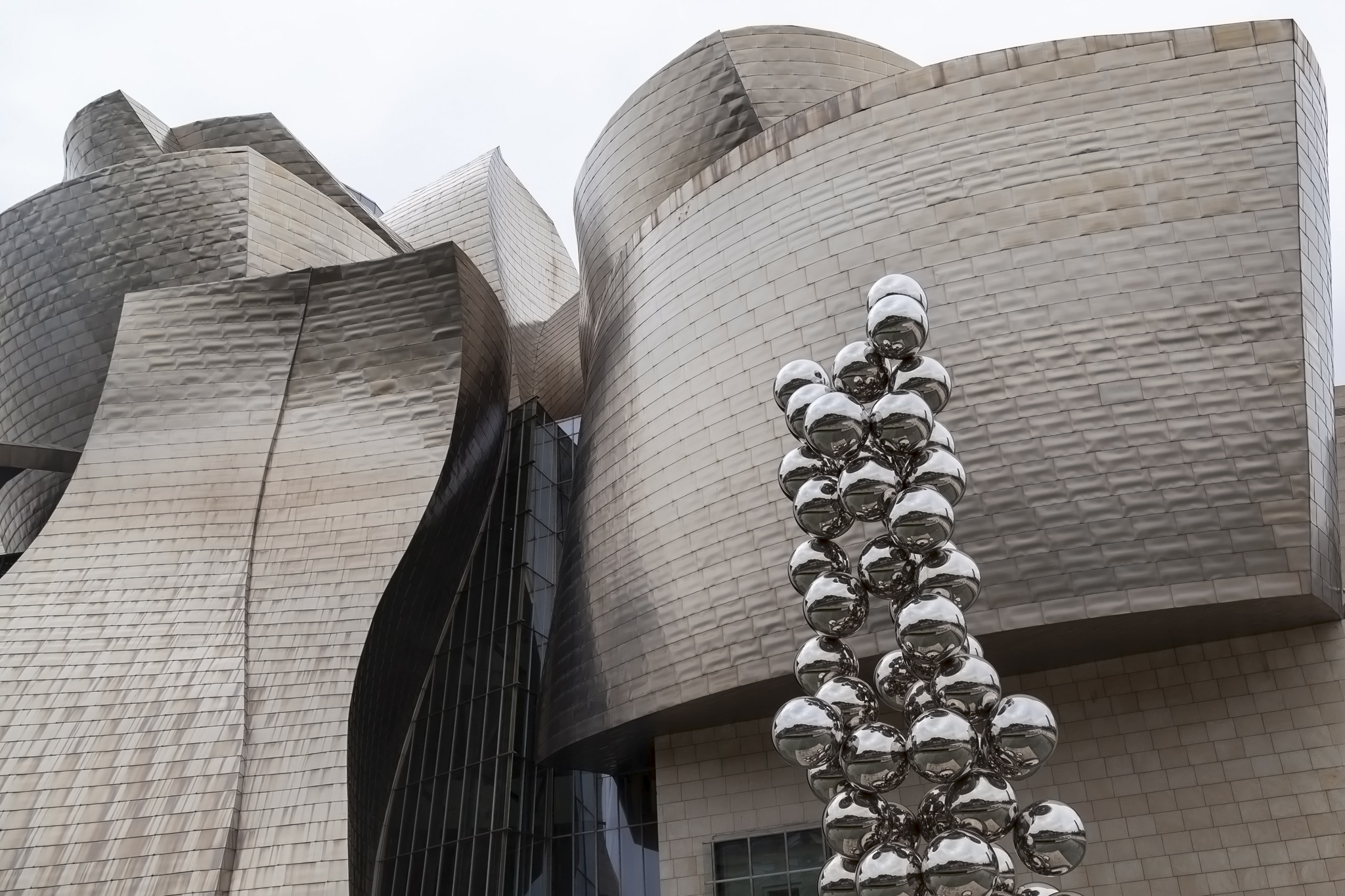
There were two prominent sculpture pieces outside the Guggenheim Museum. The first of these was Anish Kapoor‘s Tall Tree & The Eye consisting of 73 highly-reflective, stainless steel balls. This proved to be popular with people posing in front of it and I happily grabbed someone doing just that.
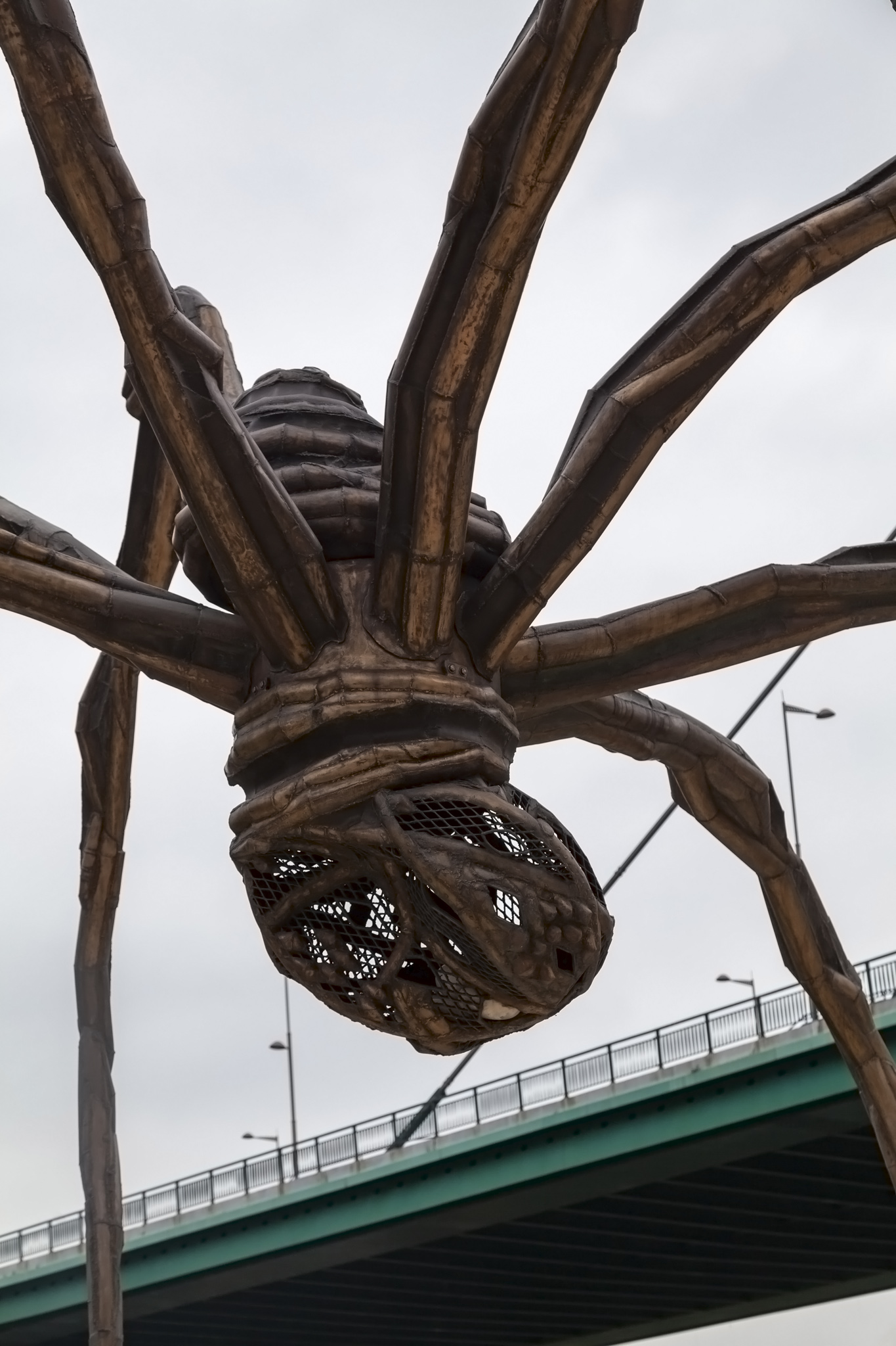
The second work was the almost 9-metre high, disturbing, spider creation, Maman by Louise Bourgeois. The name of the piece comes from its creation as a tribute to the sculptor’s mother who was herself a weaver. It’s a beautifully eerie work and my only regret is that the weather wasn’t ideal for capturing nice pictures of it.
But, of course, the majority of photos taken were of the Guggenheim Museum itself. Under clear skies and sunshine I imagine the change in colour tones as the light reflects off the undulating titanium exterior would be absolutely enchanting and I’d love to return for an early evening in summer at some point just to see how the tone would warm. A fabulous bit of architecture that barely looked like melted chocolate at all now I think about it.
We would have preferred a lot more time at the Guggenheim in retrospect so I’m not sure that this particular excursion is one that I can recommend if you’re keen on architecture and art. If we were to return to Bilbao at some point then we’d consider simply coming to the museum and spending a lot more time on just it rather than try to cram too much into a short trip as we unfortunately did this time around. That’s the gamble, though, and we always look at these excursions – and, indeed, cruises in general – as taster trips to whet our appetites for a return visit.


